Showing traces or hiding routes
A lot of early hypertext discourse was concerned about people getting lost. Early developers and promoters of hypertext systems, especially in the pre-web period, were worried that newcomers would have difficulty navigating nonlinear texts. How can someone accustomed to reading books adapt to the strange new reading environment of links and nodes!? Robert Horn’s Mapping Hypertext from 1989 is a good early example of this work,1 in which Horn surveys issues in designing hypertext systems, the structure of hypertext works, and new rhetorical and literacy skills needed for navigating linked texts.

These worries were perhaps overblown — though there may be some poor souls still lost in hyperspace that have not yet returned to tell their haunting tales — both overestimating the novelty of hypertext (books can be engaged with nonlinearly, too) and underestimating the capacity for readers to develop new reading strategies. That said, design choices in how hypertext works are presented to readers and the ability (or not) to get a sense of the whole can impact the reader’s experience to potentially disorienting ends. Not being able to flip through the entirety of a digital text, not being able to hold the whole thing in your hand, is a significant difference from print books.
David Ciccoricco discusses disorientation as a common theme (and sometimes complaint) in scholarship around Michael Joyce’s hypertext novels afternoon (1987) and Twilight (1997); in the former, readers have no map of the whole and, in the latter, the maps that are provided do not always correspond to the text as expected.2 For Ciccoricco, a perfectly mappable text is not really the goal, and Joyce’s work demonstrates how “the process of disorientation and reorientation is integral to network aesthetics.” Maybe a feeling of not quite knowing where you are in the text is part of what is special about e-lit.
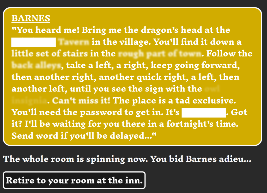
I was thinking about this preoccupation with orientation as I played through Tavern Crawler (2020) by Josh Labelle, a text game send-up of RPGs in which most of the ‘action’ consists of searching through various pubs and bars to track down a mysterious Mr. Barnes. The player encounters Barnes at the start of the game (also in a tavern!), when he sends the player’s motley crew on a mission that doesn’t quite pan out as expected. The player can track Barnes down, either to expose him, demand payment, or both.
It’s a really beautiful, endearing game, at turns hilarious and thought-provoking. But I want to home in on a particular design choice that I found especially effective. The game is driven by player choices: how to respond in conversations, what actions to take in different situations, etc. How the player accomplishes various tasks is reflected in skill points in three different categories (mage, rogue, and tank), and these choices can also positively or negatively impact the relationship with your non-player companions, Aurora and Ford.
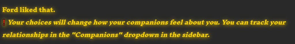
All of this is done well and effectively achieves the purpose of engaging the player in the game and getting them to invest in the choices they make, standard RPG- and IF-fare. Rather than nudging the player along slightly different paths based on these choices, though, the game shows the player all the options that would be available at different decision-points, crossing out the ones that are blocked off because stats in certain categories are lacking or because other prerequisite actions have not been taken.
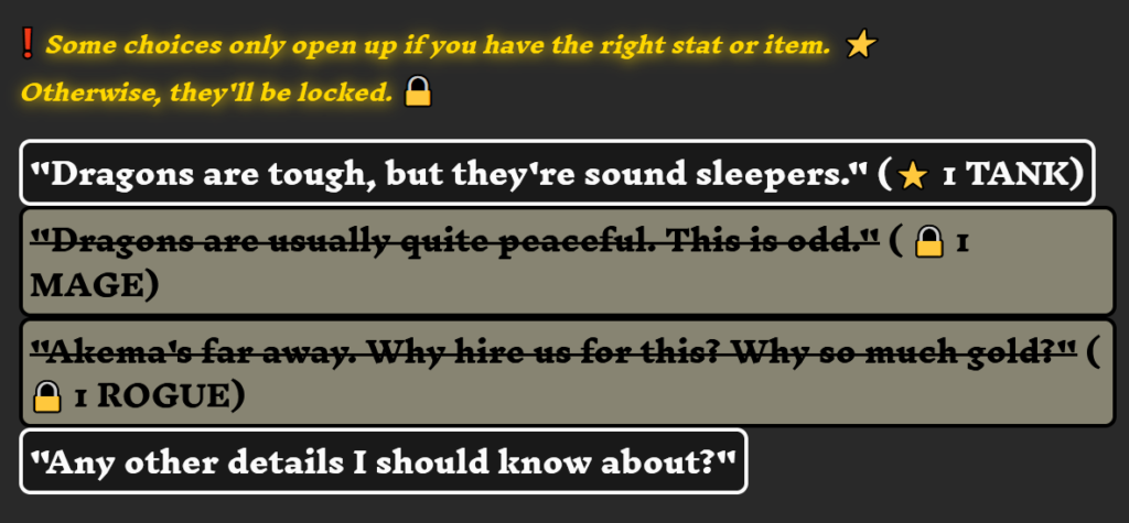
The game has many potential paths, and those paths are signposted, even if they are not currently accessible. The player still needs to feel their way through the text, never quite sure where these alternative paths lead, but this design strategy of making all possible choices at least visible (if not actionable) is a fantastic way to provide a bit of suggestively incomplete orientation. The text reveals its multiple layers, but only slightly, while still forcing the player to move through a single plane of the story.
This contrasts with Choice of Games titles in interesting ways. In CoG works, players choose from several options at each decision point, perhaps intuiting the effect of choosing one option over another—but the player can’t “go back” once a choice is made, can’t explore the other options after they’ve committed, and doesn’t have any explicit sense of where paths not taken might have led. As with Tavern Crawler, CoG titles do track different stats that reflect the nature of the choices a player has made, but the player never sees directly how a particular distribution of stats impacts the choices that are available later on.
CoG titles also contain a list of achievements (both big and small) that are possible for the player to accomplish. This list does have a similar effect to the crossed-out options in that it highlights discrete points in a multifarious text, though, in this case, the endpoints are demarcated, not the first bit of a potential path. The list of achievements in CoG titles is global—everything that’s possible—while the crossed-out lines in Tavern Crawler are localized. These are all the choices that could ever be made at this particular point in the text.
Neither of these design options is better than the other, and I like aspects of playing both types of games. I really enjoy reading through the skein of the text in CoG titles, feeling out the shape of the narrative, making sense of the whole through how a flurry of small choices add up. I also enjoyed playing Tavern Crawler and reading the tea leaves of the crossed-out options. What would happen if I could make that choice, getting a sense of the many narratives the text can tell while limited to just one path (until you play again).
One final thing to note: Tavern Crawler is made with Twine, and makes good use of typography and text effects to help tell the story. In addition to the uses detailed above, the initial interaction with Barnes features a brilliant use of redacted and fuzzy text that shapes the rest of the game. Juuuuust when Barnes starts to divulge key details about the quest you’re about to embark on, the many drinks from the night at the tavern get in the way. The quest itself is a small episode compared to pulling the pieces back together in order to actually find Barnes.
I do have a soft spot for the default font/style of Twine games, but it’s really cool to see the manipulation of text/typography play into the telling of the story itself. Definitely something I want to think more about!
References
- Horn, Robert. Mapping Hypertext: The Analysis, Organization, and Display of Knowledge for the next Generation of on-Line Text and Graphics. Lexington, MA: Lexington Institute, 1989. https://archive.org/details/mappinghypertext0000horn.
- Ciccoricco, David. Reading Network Fiction. Tuscaloosa, AL: The University of Alabama Press, 2007: 83, 90.